This is the space where I co-create custom design for small businesses and nonprofits. I provide design services for people who want to communicate clearly, build visual consistency, and connect with those they serve.
Join me in The Studio to refresh a visual identity, launch a new initiative, or untangle a backlog of inconsistent files. This is where we shape creative work around what matters most to you.
I specialize in:
At every step, I aim to make design feel approachable and collaborative—not mysterious or overwhelming. You’ll feel informed and involved throughout the process.
Each project starts with conversation and clarity. Together, we define your goals, identify what’s working (and what’s not), and build a plan for your team.
Whether you need a full brand system or support tightening up your production files, the goal is always the same: build something that’s beautiful, useful, and true to your mission.

Imagine
We start by uncovering your goals, values, and vision. Through conversation and early concepting, we build clear creative direction—together.


Create
With a shared vision in place, I design thoughtful, functional assets that reflect your brand and connect with your audience. You’re part of the process throughout.


Empower
Final files are delivered clean, organized, and ready to use—complete with helpful tools or documentation so your team can move forward with ease.
— Kiley P.
Kleenex x Self Care is for Everyone
Packaging Design + Illustration + Visual Storytelling
This collaboration between Kleenex and Self Care Is For Everyone aimed to promote mental health awareness through everyday products. I was one of several artists invited to design limited-edition tissue boxes with messages of support and self-kindness. My contribution combined hand-drawn elements with abstract shapes and a nostalgic softness, designed to feel like a moment of care sitting quietly on the shelf.
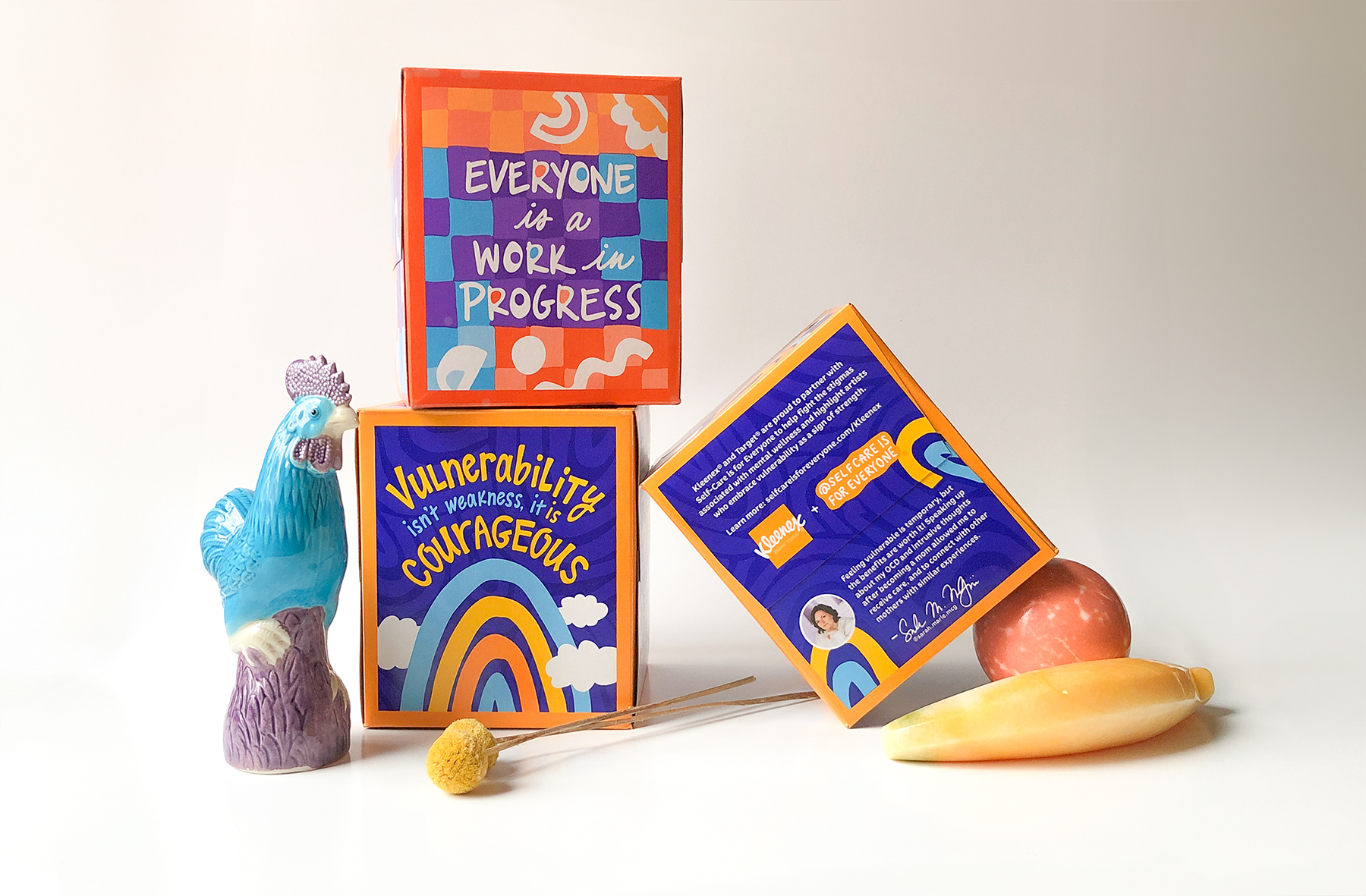

The brief for this project was clear and meaningful: create artwork that would inspire, comfort, and spark joy in a small, intimate way. I approached the design like a visual affirmation—leaning into softness, imperfection, and emotional resonance.
Each box features a hand-drawn layout with elements like clouds, rainbows, and playful geometric forms. I kept the lines intentionally wobbly, and the color palette grounded and warm, echoing the collaborative brands' values of self-acceptance and gentle strength.
Project highlights:
Medicine Fish Partnership
Website Design + Marketing Collateral + Ongoing Support
Medicine Fish is a Menominee-led nonprofit that uses Indigenous ecological knowledge to protect and restore waterways through community, education, and research. Our work together began with a website refresh—but quickly evolved into something much more collaborative.

Our first project focused on reshaping the look and feel of Medicine Fish’s website (still in development), providing a clear content hierarchy and reinforcing the organization’s mission through a visual style rooted in woodland motifs. From there, I continued to develop the visual identity through Canva templates for grant proposals, donor letters, and flyers, each designed to be easy for the team to use independently.
The relationship grew further when I had the chance to design graphics for Sturgeon Fest, an annual community event honoring the sturgeon and all it provides to the Menominee people. These pieces carried the same woodland visual language, reinforcing the unique cultural identity of Medicine Fish.
Today, I’m a trusted design partner of the Medicine Fish. I assist with visuals and templates so they can stay focused on their mission. It’s an ongoing, values-aligned collaboration that I’m deeply proud to be part of.
Project highlights:
Strategic Intelligence by DMI
Visual Identity + Presentation Design + Marketing Collateral
The Strategic Intelligence team at Dairy Management Inc. came to me with a strong concept and a logo—but no defined visual identity for their innovative arm of the organization. They needed a flexible system and a standout PowerPoint template to help their insights gain traction with clients, especially in high-stakes presentations.
We began by identifying reference points: innovative, trusted brands like Nike, Apple, and WGSN. From there, I created four moodboards inspired by the brand’s core attributes: trusted, objective, curious, sleek, and modern. Each board explored distinct directions in color, layout, iconography, and typography. After some thoughtful iterations, we landed on a bold, editorial style inspired by disruptive tech brands and infused with a fresh color palette drawn from the dairy world.

Once the direction was set, I built a robust PowerPoint template with flexible layouts, a custom set of 18 innovative dairy product icons, and a curated library of imagery that balanced science and style.
A few months later, I was referred to another team member to help with marketing materials for their tradeshow booth. The final deliverable: a bilingual (English and Japanese) sales sheet highlighting their latest research.
Project highlights:
Baby Showers Fabric Collection
Surface Design + Collection Development + Visual Storytelling
A soft, rain-inspired collection created for a friend’s baby, this project blends personal meaning with thoughtful pattern design. The goal: a modern, cozy set of prints that feel sweet without being overly saccharine—something parents and little ones would both love.


This collection began as a personal gift and turned into an opportunity to explore quiet storytelling through surface design. I drew inspiration from classic baby motifs—clouds, raindrops, and simple checks—but gave them a hand-drawn, less literal feel using muted, layered tones.
The final set includes multiple patterns intended to coordinate across fabric types and scales, suitable for use in swaddles, nursery accessories, and children’s apparel.
Project highlights:
You don’t need to come in with all the answers. If you know your visual brand isn’t doing what it should or you're just ready to feel a little more organized, I’d love to hear about it.